CONTEXT
Our team was contacted by the Office of the Chief Technology Officer in Washington D.C. to research, evaluate, and design a platform that assists DC career shifters in their quest to explore, identify and land a job in their desired field. Ultimately, we hoped to create path finder platform that provides a culmination of information on industries for those who have little to no knowledge about their desired fields — as well as provide them with a guide to landing that job. On this team, I worked as the interaction lead although I was heavily involved in the process from start to finish.
When we first dove into the OCTO website, we noted that the career resources were buried in the site.
OUR MISSION
Create a new website that puts the emphasis on these resources for OCTO.
OUR PROCESS WAS LEAN
DEFINE
MARKET RESEARCH
Before talking to any potential users — we worked on conducting market research assessing other “path finding” sites such as PathFinder, ASA Futurescapes, and Career Explorer. We conducted a feature comparison of these sites to determine the key features that assist in a path finding and creating website.

We identified some areas of opportunities as well as some must haves for our product. We found that many products give specific job titles rather than providing a general lay-of-the-land and foundation of research for their users to get a feel for their potential job industries. This validated the need to create a platform that allows users to do some exploration on the general job landscape in their desired fields.
SURVEYS
We then conducted surveys that we hoped to glean initial user insights and find our user interviewees. With 68 respondents, from ages 22 to 66, we found that a majority of users applied for or found jobs either online using a desktop (85%) or in person (13%). This finding eliminated the need to create a mobile responsive site. Respondents ranged from working in just one career field to over 10. Some additional findings are listed below.
USER INTERVIEWS
From these surveys, we were able to recruit 16 interviewees ranging in age from 22 to 55 and representing 14 different career fields. Through these interviews we hoped to understand how people actually utilize career resources and find the gap between a user's search and reaching their goals. Furthermore, we wanted to identify our assumption that when a user has recognized their goals, dream jobs or potential career paths, that they have the desire for steps on how to actualize those aspirations. Below are a few samples of our interview questions.
SYNTHESIS
From these interviews, we realized the actual need for the product we hoped to create. Many users noted that they felt resource overload when searching for a job — too much information that made it hard for them to even find what they were looking for. A resounding sense of confusion was noted when it came to searching for jobs, with tales of trouble originating in differing job titles for the same job, dishonest hiring managers, and interview anxiety. When it came to actually changing their career, most users weren’t comfortable with taking that leap into a new field. They didn’t know where to begin or they were uncertain if the change would even be worth the effort.
We then began affinity mapping from both our surveys and our interviews to pull out key insights that echoed across the board.

After affinity mapping, we found one stand out quote that hit home the need for our product regarding changing careers:
"I don't know how to prepare and I don't even know where to start."
PERSONAS & PROBLEMS
We identified two types of users:
-
the user that doesn’t know what job they want but definitely wants a new one.
-
the user that knows what job they want but doesn’t know how to get there.
From these 2 situations, we created 2 personas as representations.

We wrote problem statements to help us keep our focus on the issues at hand based on these personas.
Daniel knows he’s not happy at his current job but isn’t sure where to go from here. He wants a career that aligns with his interests, but doesn't know where to begin and wonders if it’s even worth it to start all over again.
Patricia wants to pivot careers and start working towards their dream of owning their own business. Patricia feels overwhelmed by the amount of resources available and isn’t sure how to break down their goals to continue along the path they’ve pictured.
Next, we created Superuser Sara to combine these two user problems and better tell the user’s journey.

Sara acts as a summation of both the research portion of the career shifting job search and the user who needs help figuring out her path to actually land that job. Moving into the design process, we were thankful to have Sara to keep in mind throughout each iteration.
DESIGN & ITERATE
SKETCHING
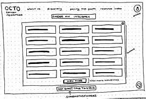
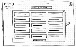
To start off the design process, we held a design studio to get as many ideas flowing and into the mix as possible. At first, we did lose our focus getting caught up in creating another “professional networking” platform instead of providing a product for the initial ask — creating a career resource for DC residents that helps them explore, identify and pursue their desired roles.
After this initial set back, we reframed and rehashed the ask in order to get the team back on the same page and on track with the intention for the product.
We then began re-sketching and annotating as we sketched.




PAPER PROTOTYPE
Next: Paper prototypes to prepare to get some initial feedback on our ideas.
In this iteration, we received two valuable pieces of feedback:
-
The path page wasn’t intuitive & it should be vertically oriented.
-
The job details page should include event page links such as Eventbrite.
WIREFRAME & USER TESTS

Moving into the user testing phase with 5 user tests, we garnered as much feedback as we could to make sure we were prepared when moving into the final clickable prototype. Below are the main takeaways from our users tests:
-
Multiple Testers mentioned confusion between “Discovery” & “Pave My Path” noting it as “vague.”
-
Two participants noted they prefer having the sign up/log in obvious on the home screen instead of navigating through the profile button.
-
Two participants didn’t understand what the “Pave My Path” page was getting at in this edition of the path.
-
Three participants noted wanting to have an RSVP option for Networking Events within the site.
-
The checklist wasn’t intuitive for 1 participant who also noted that the collapse button wasn’t obvious.
-
Lastly, users wanted to see potential listings when seeing the overall job description, potentially wanting an added in a LinkedIn link.
After receiving this feedback, we started our work on incorporating these fixes to our final clickable prototype! Below are a few highlights of these changes.
Multiple Testers mentioned confusion between “Discovery” & “Pave My Path” noting it as “vague.”
Here we clarified the confusion between the buttons with a short explanation above.


Two participants noted they prefer having the sign up/log in obvious on the home screen instead of navigating through the profile button.
We added both a sign up and log in button to the home screen.
Two participants didn’t understand what the “Pave My Path” page was getting at in this edition of the path.
Here we made an edit to the path that highlights its function as a path which when searching for a particular job, triggers buttons to populate and therefore provide resources for them along their journey.


Three participants noted wanting to have an RSVP option for Networking Events within the site.
As requested, we added an RSVP option when selecting a networking event. This RSVP button will trigger an exit from the website to the event’s original RSVP page.
The checklist wasn’t intuitive for 1 participant who also noted that the collapse button wasn’t obvious.
This checklist is included on all extraneous resource pages as well as in the dashboard. After this feedback we changed the collapse button to a “-” in the upper right hand corner as this is a recognized convention. Adding the color to the checklist as well as more information to it — actual tasks — allows users to more easily understand its function.


Lastly, users wanted to see potential listings when seeing the overall job description, potentially wanted an added in a LinkedIn link.
Here we added a link “Looking for jobs near you?” that directs users to the resources and tools they need to find potential job listings in their desired field.
These are just some of the highlights in our iterative process and for the purposes of this project - our stopping point. If you'd like to see more of this iteration feel free to take a look at our clickable prototype.
. . .
Although this was all that was needed for this project, I came back and updated the prototype to a higher level fidelity.

NEXT STEPS
HIGHLIGHTS
-
Tools: Feature Comparison, Surveys, User Interviews, Affinity Mapping, Personas, Sketches, Paper Prototypes, Wireframes, Usability Tests, Prototypes (lo-fi to hi-fi) using Axure
-
Synopsis: Created a clickable prototype of a career resource discovery and planning tool for career path shifters for client Office of the Chief Technology Officer using the entire design thinking process.
-
Timeline: 3 week sprint
-
Role & Team: Worked as the Interaction Designer on a 3-person team.
If you’ve made it this far, I salute you. This is a lengthy one — not too much more I promise! Looking to the future, we have a few next steps we’ve suggested.
-
More resources: The whole essence of this OCTO careers platform is to be a source of resource compilation. If resources are listed and presented in ways that don’t overload the user (laid out as we have here), more options for the user are better. Space them out — don’t just toss a bunch of information at them — have them follow a flow that allows them to simply understand them.
-
More fields: When a user is looking for a new field of work, they want to see the plethora of options available to them. Integrating this by incorporating a strengths assessment within the site would avoid bombarding them with an overwhelming amount of choices. Allow users to discover the options that may best for them based on their actually interests and strengths combined.
-
More jobs: As more fields are added and compiled within OCTO careers platform, more potential jobs follow suit. As long as this is done in a way that avoids information overload, more potential jobs would help the user. By first incorporating the strengths assessment, additional jobs shouldn’t be an issue.
-
Integrating other platforms: Pulling from Glassdoor to show employer ratings would greatly help users identify quality job postings as well as integrating LinkedIn to point users in directions that would help them with networking and actually applying to jobs.
A huge thank you goes out to the Office of the Chief Technology Officer in Washington D.C. for this opportunity!
Focusing on heavy research to ensure our utmost understanding and accurate definition of the problem, then moving onto design and iterations between user test and feedback sessions and finally testing our final prototype for implementation.
91% of respondents noted that they have used a career resource to find a job which validated the need for our product as well.
44 respondents noted that role explanations and job details as the most helpful about these career resources while tied for next in highest responses were qualification explanations as well as steps to attaining the position.
49% of respondents noted feeling confused while looking at job boards.
What are your career interests for the future and if you could do or be anything, what would you do? How would you get there?
If you have worked in more than one field of work, what was transitioning from the old field to the new one like?
What were your biggest difficulties?When searching for a new job, what is your process like? For example, do you look for specific titles or specific companies?
Incorporating these pieces of feedback, we started building in Axure. We created not only the path but incorporated a checklist to help people keep track of what's left to do which auto-populates from the saved path. We also incorporated an option to edit a path when saved to a user’s account, in addition to a resource index for extraneous job resource material that is linked to the path as well.


