M A M A C I T A
THE CONTEXT
MamaCita is a parent-to-parent childcare platform, where members are able to seek care and/or provide care. The platform also serves as an invite-only social network for parents to connect and share their experiences. MamaCita is more than just a childcare marketplace — it’s also a community — revolutionizing the childcare industry.
Cara, the founder, came to my team in search of assistance in developing her platform's onboarding process. She had concerns about friction in the process as she was including a mandatory background check before users are even allowed to enter the site. She also hoped for some validation of her product overall and some understanding and research on her niche in the childcare market.
THE SCOPE
From here, we determined the scope — to gauge the interest of parents in the platform in order to validate the product. Additionally, to identify best practices for onboarding processes that have multiple touch-points as it connects to MamaCita and the platform’s goals in the short and long term.
THE OBJECTIVES
We wanted to further detail our deliverables and our process for this sprint. We used the Design Thinking Framework to guide our process. First, we conducted competitive analysis, surveys and user interviews. Then, we synthesized our research using affinity maps and personas in order define the problem. Finally, we created sketches, wireframes and a prototype that users tested. After four rounds of iteration, we developed our final prototype and information for developer hand-off.
THE TEAM & MY ROLE
The team consisted of 3 members, of which I worked as the Project Manager although assisted heavily in all of the other aspects of the project (user research and interface design). We worked on a 3 week sprint timeline.
RESEARCH
To start off — we conducted secondary research to get a feel for where exactly MamaCita is in this space alongside the likes of giants such as Care.com and Sittercity.
FEATURE COMPARISON
We started with a feature comparison to understand what these companies included in their platforms to give us an idea of what should be included in MamaCita and its onboarding process. From discussions with the founder, we already knew that background checks would be mandatory for all members.

MARKET MATRIX
We wanted to further visualize what these features meant for where exactly MamaCita is placed in the market— so we created a market matrix, plotted with each of these childcare marketplaces.

A few notes additional notes:
-
Care.com promotes safety but the platform doesn’t require background checks—they are available for a steep fee. They focus solely on being a marketplace rather than a place of social connection.
-
Sittercity and Urbansitter both require background checks and identity verification. They are both used for hiring babysitters rather than sharing experiences other than reviews. Urbansitter does connect with your social media to find sitters using your own network.
-
Sitting Around focuses on the social aspect of childcare, offering co-hort and co-op babysitting where children can socialize. They do not offer safety measures like reviews or background checks.
-
MamaCita heavily focuses on these two aspects: providing a social network to connect with other parents’ experiences and providing a SAFE marketplace for childcare with background checks required for all.
SUBSCRIPTION PRICES
Another part of the onboarding process that needed to be included (as directed by the client) was payment for the membership. This payment was required in order to cover the background check. With this in mind, we wanted to provide some background on the competitors' pricing models.
MamaCita’s plan is to charge $40 dollars a month on the first of every month.


This price is on par with Care.com and Sittercity but double and over triple Urbansitter and Sitting Around. We wanted to keep pricing in mind as we moved into user interviews and tests to glean user thoughts, as well.
COMPETITOR ONBOARDING PROCESSES
Next — we took a look at competitor onboarding processes. We wanted to see what was working and what common conventions were being used.


-
Care.com and Sittercity both incorporate simple icons into their sign up processes that allow for ease of use and an added touch of fun to answering the questions.
-
Urbansitter focuses on one question at a time with a lifestyle image in the background.
-
Sitting around requires you to enter credit card information before you even begin the onboarding/sign up process.
We kept these onboarding processes in mind when tackling building our own.
SURVEYS
Next up — surveys! We conducted surveys to get in touch with potential interviewees. I’ll be honest…it was a HUSTLE. As I’m not a young parent myself, it took some work to get a foot into this network. So it was so exciting that we got 60 respondents — 53 of them being parents.
We were especially psyched that 37 of the parents had children ages 0–4 because this is the segment of parents that MamaCita is hoping to target.


INTERVIEWS
From the surveys, we found 12 interviewees that were all parents. Before we interviewed anyone, we wanted to remember why we’re here — to reach an in depth understanding of parent-to-parent childcare. Additionally, to identify best practices for onboarding processes that have multiple touchpoints as it connects to MamaCita and the platform’s goals in the short and long term.
We then began the interview process. Below is a snapshot of the questions we asked our interviewees.
What are important aspects to you when it comes to someone who’s watching after your children?
Tell me about a time when you had a bad experience with a sign up/onboarding process for an app or website.
How do you feel about both parties needing to complete a background check for a childcare platform?
Do you consider other friends who are parents an easy way for finding childcare? Why or why not?
How do you usually find a babysitter?
Have you used any online babysitting platforms? Why or why not?
How do you judge the trustworthiness of a babysitter?
SYNTHESIS
We then moved into the process of synthesizing for our key findings from our research through affinity mapping and found some key takeaways.
Users appreciate when sign-up questions are directly relevant to them.
Generally, if the parents don’t know the person - reviews, references and recommendations are very desirable.
Most parents put trustworthiness of their sitter first, and either test potential sitters or need to meet and know them before they let them take care of their child.
Many parents find their sitters through word of mouth in their communities.
Parents who found sitters or nannies online found them in Facebook groups or on Care.com.
Users want the sign-up process to be simple and easy, with limited hoops to jump through.
There were two quotes from our interviewees that spoke directly to, and summed up our user research overall.
"When it comes to a sign up, don't waste my time." - when discussing lengthy onboarding processes with many hoops to jump through
"I won't leave my child with someone I don't know." - when talking about why they don't find sitters online
PERSONAS
With all of this research done, it was time to put a face to the background, with Miranda.

Keeping this persona and all of our research in mind, we created our problem and solution statements.
PROBLEM
Miranda is an essential worker looking for a platform to help her find a trustworthy childcare provider in the middle of the COVID pandemic. She needs a site that is secure but also has an easy sign-up process because she is a mother with a full-time job.
SOLUTION
We believe that by designing an onboarding process with limited emails and that can be completed in a single sitting, we will create a streamlined and efficient experience for users.
We will know this to be true when users are able to complete onboarding without confusion.
DESIGN
USER FLOW
Before getting into the nitty gritty, we started with a user flow to get a feel for each step in the onboarding process aside from just the actual sign-up itself.

Our goal — make this multi-step process, as simple and easy to complete as possible. We don’t want the user to have the chance to stop to realize how many questions they’re answering because the process is just that simple.
DESIGN STUDIO & SKETCHES
We held a design studio for our team to ensure we all contributed our ideas for what our prototype would contain and how we each were envisioning this sign-up process. We landed on our final sketches before taking to Adobe XD.

WIREFRAMES & LO-FI PROTOTYPES
Next, it was time for Adobe XD — our wireframes & lo-fi prototypes.


click to expand
These screens looked pretty similar to our final sketches but we added some interactivity to conduct the first round of user tests.


BACKGROUND CHECK
After we tested the first round, we decided to incorporate the background check within the question flow in this iteration. Originally, we prompted users to complete the background check after submitting their questionnaire, but we worried people would put it off and lose the link. We figured that by making it a required step in the submission of their questionnaire, people would feel a more immediate pressure to complete it. We also thought this would mitigate the risk of the link getting lost as well.
We were really interested in testing this out with the next round of users because we weren’t sure whether they’d understand what we were trying to communicate.
USER JOURNEY MAP
Once we'd created the flow of our prototype and done our first round of user tests - we created a journey map that details the user journey and their emotions throughout the onboarding process.

click to view
STYLE GUIDE
Before we moved into our final round of user tests, we knew we'd be entering our highest level of fidelity in this round so we created a style guide. This guide works to ensure consistency is used across all text, color, and formatting in the entire prototype.
We drew inspiration from MamaCita's current landing page —using the current typefaces, similar button colors, and similarly styled illustrations.

USERS TESTS — ROUND 2 (cue the wrestling “ding ding ding”)
For this round of tests, we had 3 users lined up to try out our product, all different users than the first round because we wanted some fresh sets of eyes.


ALL QUESTIONS
In this iteration, we changed the button colors to further distinguish between the back button and the next button.
We also changed the answer icons to be colored gray when unselected so that it was clear when they were disabled.


SUBMISSION SUCCESS PAGE
Users noted that the text on the submission page was very dense.
We made the farewell blurb on the thank you page more succinct by taking out any unnecessary information, and breaking up the text so that it is easily readable for our users.
BACKGROUND CHECK
Lastly… and perhaps our most exciting result…
users understood the process for completing the background check on Checkr and returning to the MamaCita onboarding process afterwards. Our design had been validated and so we felt comfortable moving forward.


THE FINAL PRODUCT
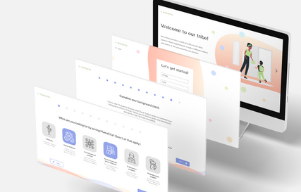
Finally, our prototype was finished and ready to be demo'd to our client!
In this final product, we added a portal page for pending applications. Here users can still have some contact with the platform to keep up on the status of their background check and learn additional details about MamaCita and its guidelines, purpose, and mission. We also changed the progress bar to a bar of circles that can be selected to move between questions—this allows for easy error resolution and navigation through the sign up.

Try it out!
SERVICE BLUEPRINT
We thought it was pertinent to also create a service blueprint that summarizes the entire onboarding process from start to finish.
This is important because onboarding does not only take place within the MamaCita sign-up process and portal— there’s a lot of work that goes on behind the scenes in order to create a streamlined and efficient experience for the customers.

In this diagram, the customer journey is outlined in the row at the top.
In the next row, the “frontstage,” are the actions taken by MamaCita that are visible to the customer. These two categories are the main touch-points in the onboarding process.
The “backstage” and “support processes” show what MamaCita has to do behind the scenes in order to get the customer onboarded efficiently that the customer never sees first-hand.
NEXT STEPS
With all of this work done, we had a few next steps we needed to share with the founder before the final hand-off.
-
Once there are enough users in MamaCita within groups — consider adding the number of users in each potential group in the sign up process. This will give users a sense of trust in the platform and further convince them that this $40 is worth spending.
-
Consider implementing a referral program that allows for a waived or discounted sign-up fee if they’ve referred other parents to the platform. Again, this provides a sense of trust as you build the MamaCita brand within already established communities.
-
Consider adding more to the portal page with options to fill out additional questions & conduct user tests on this feature.
-
Establish the guidelines and regulations for all MamaCita groups to ensure safety throughout the platform.
A special thank you to Cara at MamaCita for this opportunity!
HIGHLIGHTS
-
Tools: Feature Comparison, Competitive Analysis, Market Matrix, Personas, User Flows, Sketches, Wireframes, Adobe XD, Lo-fi & Hi-fi clickable prototypes, Usability Testing, Service Blueprint, Journey Maps
-
Synopsis: Executed the complete design thinking process for the multi-touchpoint onboarding process that communicates trust and motivation to follow through with the sign-up for client MamaCita.
-
Timeline: 3 week sprint
-
Role & Team: Acted as the Project Manager for my team of 3, although had a heavy hand in both the research and the design processes.
REFINE
USER TESTING — ROUND 1
We went into our first round of tests excited to see what our users had to say! We had 5 participants and gave them 3 “tasks” which basically amounted to the 3 sections of our onboarding — general information, the initial question flow, then scheduling an interview and submitting the sign-up.


WELCOME PAGE
A resounding piece of feedback was that the welcome page from the email invitation was too text heavy and hard to read.
To mitigate this, we turned the welcome page into an interactive carousel where users can click through for the information they needed in an easily digestible way.


QUESTION 1
Many users were confused about the different options listed on this page, and asked for explanations of each answer option—we added more information below each options on this page.
We added a “pregnancy loss” support option at the recommendation of our client, because we want to include and represent women who may not have children, but have experienced pregnancy loss and are still looking for community and support.
Lastly, we added color to make the buttons pop out. Our progress bar also got a lot of positive feedback with users noting it as encouraging but we decided to make it slimmer in this iteration to make it a little more sleek.


QUESTION 5
Similarly to question 1, users were really interested in these group options, but wanted to know more about them.
We added descriptions to prevent confusion, but also to give users a glimpse into the kind of support and community they will be getting from MamaCita.


