THE CONTEXT
I was tasked by InovCares to identify the pain points in their newest UI prototype. InovCares seeks to relieve those who don’t have easily accessible medical help at their disposal and provide this through the InovCares mobile app. I sought out participants looking for an easy way to access holistic health and wellness care to test and interact with the new app to gain any insights and pain points for users.
THE GOAL
Through these user tests, we hoped to identify areas for improvement in navigation, areas of improvement allowing users to learn quickly, validate or invalidate the apps existing features, and gather insights on what the user finds useful in their health and wellness journey.
MY ROLE
I operated as the UX researcher — functioning as the facilitator, observer, and note taker throughout each user test.
MY PROCESS
After receiving the initial prototype from the InovCares team, I set out to arrange each activity flow of the app and transition it into a clickable prototype using InVision.
PERSONAS
Then I created a proto-persona that identifies the superuser of InovCares — TeleHealth Tara — to allow me to stay focused on the needs of the ideal user.

TeleHealth Tara is the ideal superuser of the InovCares application — using the app for both contacting doctors & tracking personal progress.
USER TESTING
Next, I ventured out to test this prototype with participants interested in holistic health. The prototype was tested with a total of 9 participants from the ages of 20 to 54 that were run through a series of tasks through the prototype. 3 tests were moderated and conducted in person, 3 tests were moderated and conducted on zoom, and 3 tests were unmoderated but conducted with each task detailed on usertesting.com. These tasks ranged everywhere from signing up and creating a profile to ordering prescriptions through the app.
A list of the sample tasks and background questions are listed below:
Some background questions and sample tasks participants completed in user tests.

FEEDBACK
From these 9 user tests, I pulled some key insights and problems from each task.

“Sign Up & Create Profile”: All participants were successful although noted they expected that they could scroll down on the profile confirmation page in order to confirm their information as correct. 2 participants noted binary gender, “yes or no” options for Diabetes instead of type, and the list of racial backgrounds as being limited and not very inclusive.

Of 9 Booking Appointment Tasks, 7 were deemed incomplete as many assumed they would be able to scroll on the page and a “confirm” or “next page” button would possibly be located at the bottom of the calendar page.

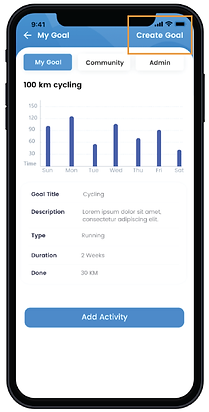
“Create Goal”: 3 participants did not notice the “Create Goal” button & thought it was a header which resulted in unfinished tasks.
All participants completed the “Prescription Order” task but over half noted that the medication selected didn’t match the search page and 4 asked if doctor’s permission was needed for purchase.


All participants finished the “Chat with A Doctor” task and noted it as simple — although 2 initially could not tell the messages were previous or current messages with doctors.
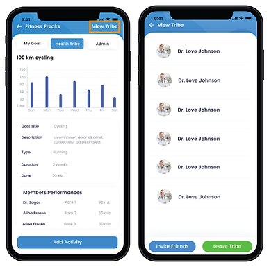
The “Add a Member To Your Community” task was finished by 7 of the 9 participants. The 2 incomplete task participants assumed that the community would be within their own profile or chat sections as they saw these as the “social functions.”

SYNTHESIS
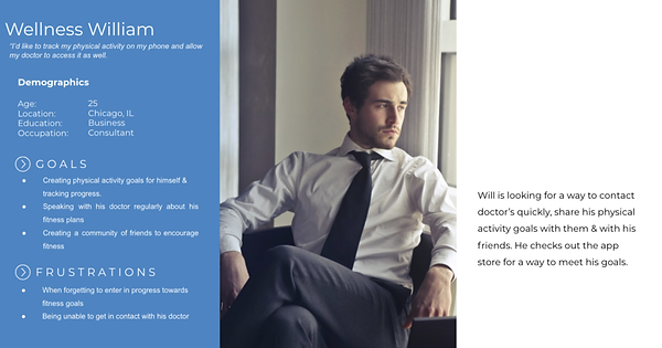
After the user tests, I created another persona that encompassed the other half of users that would utilize this app — Wellness William.

Focussing on the “Create Goal” task, I then created a journey map to understand the “Wellness William’s” experience throughout the flow.

RECOMMENDATIONS
From my synthesis, I compiled recommendations targeted at the issues found during the user testing phase.
-
Incorporate more inclusive options within Create Profile steps — update options outside of binary genders and pre-existing conditions aside from Diabetes, as well as more in depth options pertaining to racial background — i.e. a drop down for multi-racial background.
-
Implement Confirmation buttons and ensure responses (“Confirmed!”) are provided for tasks like booking appointments or finalizing your profile creation.
-
Update the “Create Goal” button to ensure it appears to be a clickable button rather than a header (i.e. add an arrow or encase in a box so it stands out)
-
Adjust goals for more than physical activity. (i.e. diet goals)
-
Ensure that check out pages and selected medication to add to cart use the same medications listed in the search section of the flow.
-
Provide access to Health Tribe/Community in both the “Goals” and the My Profile sections of the app.
-
Create a Global Navigation bar that shows up on every page — such as the Calendar, Target, Stethoscope, Chat & Profile button currently featured on many pages already!
HIGHLIGHTS
-
Tools: Usability Tests, Personas, InVision, Journey Mapping
-
Synopsis: User research and usability testing focussed project producing recommendations for client InovCares on existing prototyped product before launch—a holistic health and wellness app.
-
Timeline: 1 week sprint
-
Role & Team: Acted as the UX Researcher and worked alone.


